Exploring QUAKE LIVE
May 8, 2009 at 5:44 am johanhedberg81 5 comments
Its Evaluation Time! This week we’ll be looking at the BETA version of Quake Live that can be played online at www.quakelive.com
First impression
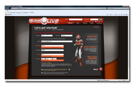
Wow, now this is messy. Those were the very first thoughts I had when I stumbled in on the web site of Quake Live. Although the overall look & feel of the interface was smooth, colorful and futuristically cool I thought that there was no obvious way of knowing where to go. Of course, that was about the time I saw that Register button up in the toolbar, and then things went a bit better. One thing that annoys me in the graphics design is the dropdown shadow of the middle section. It bothers me that it is wider at the bottom and then narrows down further up on the screen. It doesn’t feel right. I think it might have something to do with the darker section in the upper part of the page, something that implies that the light comes in from the top and down. But since the dropdown shadow is wider at the bottom that indicates that the light is displayed from underneath and upwards. These two contradictions makes the page feel “funny” or “not quite right”. One thing I did like however was the progress indicator showing while the page was being loaded. Having visual feedback during lengthy operations is a good way of indicating to the user that the application is still alive but currently busy processing something else.
Input validation works fine
The first thing I did, being the curious one that I am, was to test the input form. It had been divided into three steps, like a wizard, which is always a user friendly way to handle a situation where the user has to enter a lot of information at the same time. At first I tried not to enter any fields at all, but threw myself directly on the Next button instead. It turned out they had a fairly solid validation process for the input data.
If something had been left out, a little red/orange label was displayed under the control with the missing value. One thing I did not like about the form was the dark red color for displaying the error message at the top, right under the page’s title. Against the dark gray background of the page, that red color could be a bit hard to read. For people with vision problems, like color blindness, the text would probably be even more difficult to see.
The art of naming
Then came the next challenge, naming your character. Like with any other globally spread online service today, coming up with a unique identifier is almost an impossible task by itself. I went from everything between MrPink to silly names like TheCookieMonster, but no matter how hard I tried there always seemed to be someone else out there who had thought of it first. Finally, I found my new alias – CobolHacker. (Note: I did try just Cobol at first but obviously, that was already taken as well).
Confirmation e-mail
Once all the details had been entered in the form, it was time to click Next to proceed to the e-mail confirmation step of the process. Now this is where my problems started to appear.
I did receive the e-mail pretty short after it had been sent from the web site. It contained a link and an activation code. I took the code and went back to the web form which was now at Step 2/3 – account activation. I entered the code in a small textbox and clicked on the Next button. Funny enough, I was redirected to the same page. So I tried to enter the code again, but this time it said that the account had already been activated. But how was I to get to Step 3? There was a link on the form for requesting a new confirmation e-mail. I clicked it, but received no new mail. This was probably because the account already was activated, but if that was the case there should have been an information message to the user about it. There was none.
I went back to the original e-mail and tried to click on the URL provided. Well, that actually got me to the downloading page. But I had to click twice on “Download” to obtain the MSI-file. It got caught by the security filter of my browser, so I had to manually approve to retrieve the file.
Executing the msi and installing the plug-in went fine. No problems there. I re-opened my browser to have a go at playing. First you had to choose a character from a selection of various figures. You could also customize the controls if you wanted to. Bu then when I was to start playing a looping screeching sound appeared from my speakers and the game froze. This was at the same time as the welcome message was displaying, so the game hadn’t actually started yet. I tried to re-open the browser to start all over. I selected a character, went to the playing area and the game froze again. Crap.
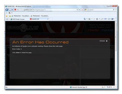
I tried to navigate myself back a few pages but ended up with a big error message on screen saying:
“An instance of Quake Live is already running. Please close this web page.
Error Code: 3
Click close to reload the page.”
So I clicked Close but got the same error page. I tried again – same error. Once again I closed my browser, re-opened it, and went back to Quake Live. When I logged in with my credentials, I was shown that same error AGAIN. Is there no way to end that session?! So there was not much more for me to do – I went to bed. This morning (10 minutes ago) I tried to log in once more. Guess what? Same error.
So it seems that my account is stuck somewhere out there in hyperspace, in a nasty jungle of error code 3’s, forever useless…
/Johan Hedberg
Entry filed under: Uncategorized.
5 Comments Add your own
Leave a comment
Trackback this post | Subscribe to the comments via RSS Feed


1. Wilhelm | May 8, 2009 at 9:46 am
Haha! A gaming report containing no actual gaming!
2. johanhedberg81 | May 8, 2009 at 4:55 pm
Yeah I know! How twisted is that? He, he.
Lucky for me, the evaluation was only to cover the process between accessing the website up till joining the first game. So I consider myself as “Safe!”. 🙂
But if I were to rate it all, then this one surely hits the bottom big time!
3. wikman9 | May 10, 2009 at 9:38 am
SIMPLE = GOOD
How long will it take for developers to grasp this concept?! Why not have a big “status” symbol on the front page, saying if it is possible to register or not at the moment. Why not have the registration system built into the installation client? Why do they need so much contact information?
It should be kept simple. Name and birthdate – done. Login and password, instant confirmation on the installation client – done. Log in and play. That’s how it’s done.
Someone give me a job, and I’ll give you a game! 😀
//Dennis Wikman
4. slimkim | May 10, 2009 at 6:46 pm
Man that really is messy, I tried QuakeLive a while ago and I too thought it was to complex to register/get the game working. Same goes for Battlefield-Heroes beta program which just is hilarious. I’m impressed people can earn a living designing to complicated registration processes, sometimes it feels like thay’ve actually made and effort just to annoy the players :(.
When I finaly got to play QuakeLive it didnt run as smooth as a fast-paced FPS should, could’nt enjoy it really.
I must agree on Dennis statement, simple is good!
Less is more and simplicity is the future, those are words I want to make reality, hopefully not too far into the future.
Anyhow, great evaluation Johan! A pleasure to read, as always!
/Kim Bertilsson
5. hammerslay | May 10, 2009 at 8:04 pm
Seems like you ran into a lot of problems there Johan 😉
I first tried out the beta version of Quake Live, I really can’t remember having this much of a trouble to get to the playing.
There are however some quite annoying factors to this game, other than the ones that you had with registration and the game freezing and so forth.
The fact that you have to play through a session with a bot just for the game to get to know how good you are and place you with the right people is rather annoying according to me. It is a game that is supposed to be really quick to get into, and having to wait and play with a boring bot before getting to frag your friends online is not my idea of being the quickest way to get into the fray. Maybe they should have had this as an option so that players could skip it if they wanted, but if I remember correctly that wasn’t an option (I could be wrong though).
Another thing that I think could be threshold for players that want some quick action is the HUGE waiting cues that at least were present when I tried it out. And I am talking about maybe close to 30 000 players being in front of you in the playing cue. And if that doesn’t scare at least some people away, I don’t really know what would. It scared my away when I played it though 🙂 Perhaps this was only an early problem though, as I hope that the developers bring more servers online to meet the demand of a rising player base. Perhaps they already have.
Anyways, great reading Johan!
Regards
Jakob Lindh